Overview
MK.IO is MediaKind’s modern, cloud-native streaming platform built to simplify and accelerate video services (live and on-demand) at broadcast quality. It brings together ingestion, encoding, delivery, monetisation, security, and cloud orchestration into a single offering, suitable for both traditional media companies and newer entrants into video streaming.
Overall Goal
To design an intuitive, efficient, and scalable interface that enables users to create, monitor, and manage video streaming workflows, ensuring a smooth experience across technical and business user roles.
User Flows & Task Mapping
Each user persona (e.g., developer, media operator, broadcaster) has distinct goals. We as a UX designers map end-to-end task flows to identify key screens, interactions, and data states.
Examples
- “Create a Live Stream Workflow” → ingest setup → encoder selection → output packaging → publish
- “Monitor Encoding Jobs” → dashboard → job status → error logs → retry or terminate
- “View Analytics” → usage metrics → bandwidth, concurrency → cost estimation
Output: User flow diagrams, Task hierarchy maps
Wireframing (Low- to Mid-Fidelity)
Wireframes visualize layout and navigation before visual design begins. They define hierarchy, information placement, and control density.
Activities:
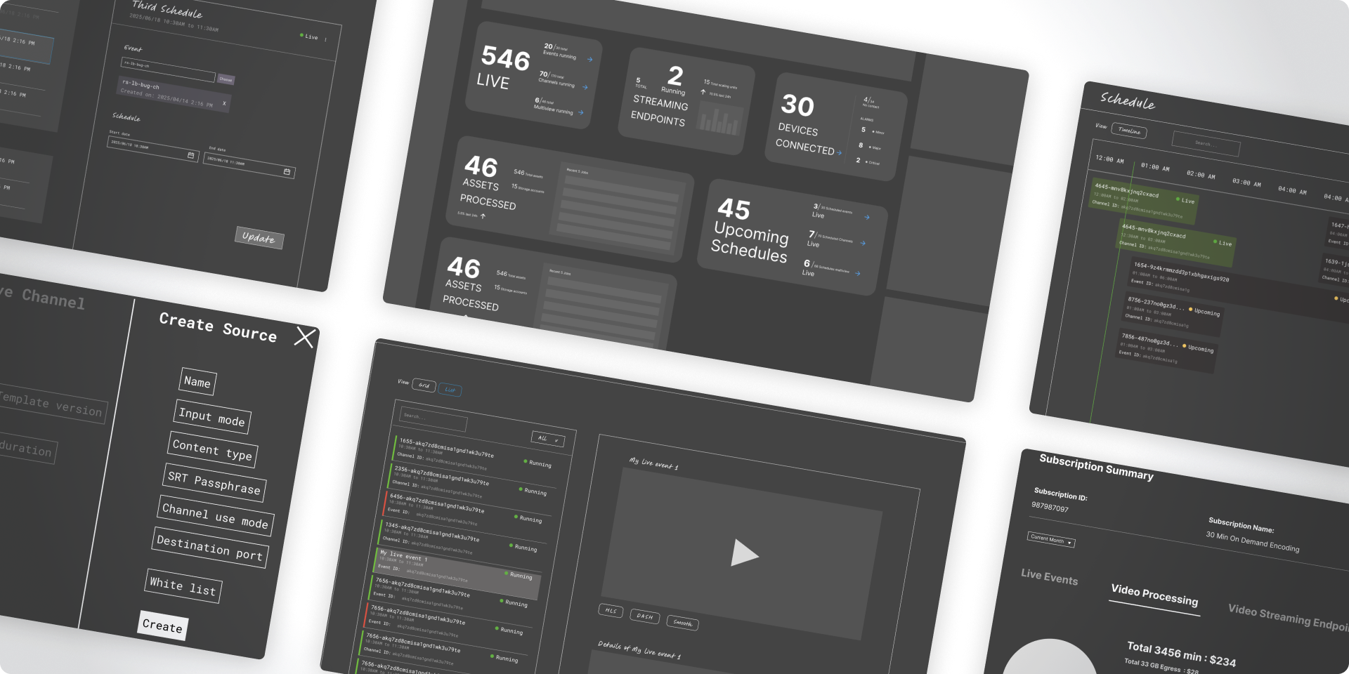
- Dashboard with cards summarizing live jobs, alerts, and resources
- Left-panel navigation for modules (Ingest, Workflows, Assets, Analytics)
- Clear status indicators for real-time job tracking
- Inline settings panels for faster configuration
Output:
- Wireframe sets (desktop-first, responsive variants), usability testing prototypes
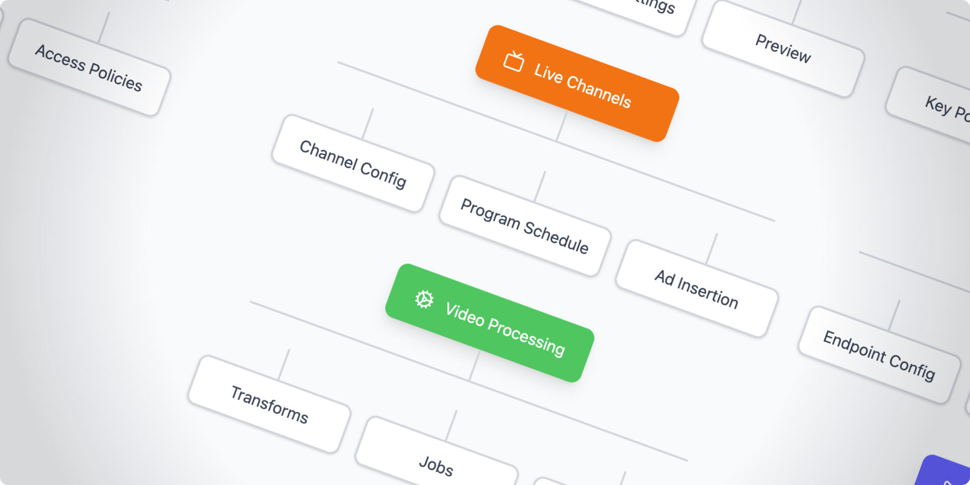
Interaction Design
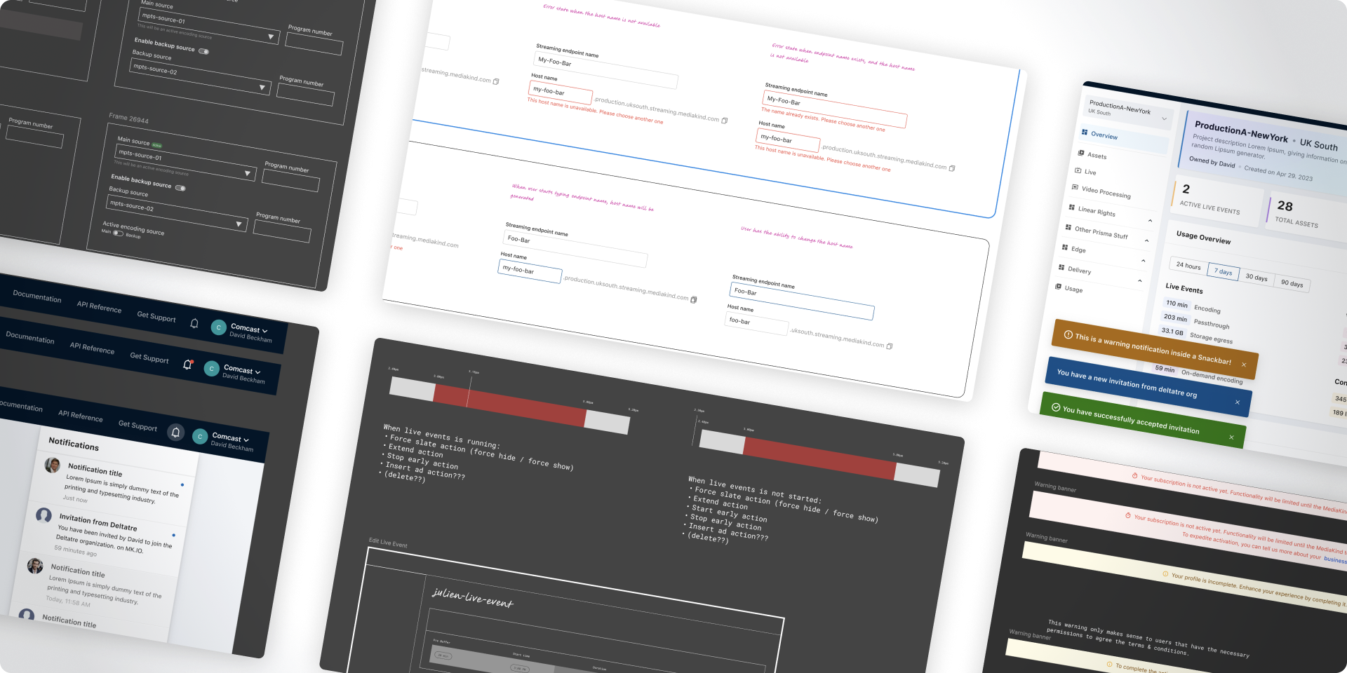
Defines how users interact with components, transitions, and workflows. In a system like MK.IO, interactivity clarity is crucial for:
- Dynamic states (loading, processing, completed, failed)
- Modal behaviors (start workflow, add stream output, edit credentials)
- Drag-and-drop workflow builder (for linking ingest → encode → publish nodes)
- Real-time notifications (e.g., encoding errors, billing alerts)
Output:
- Interaction specifications, motion/transition documentation
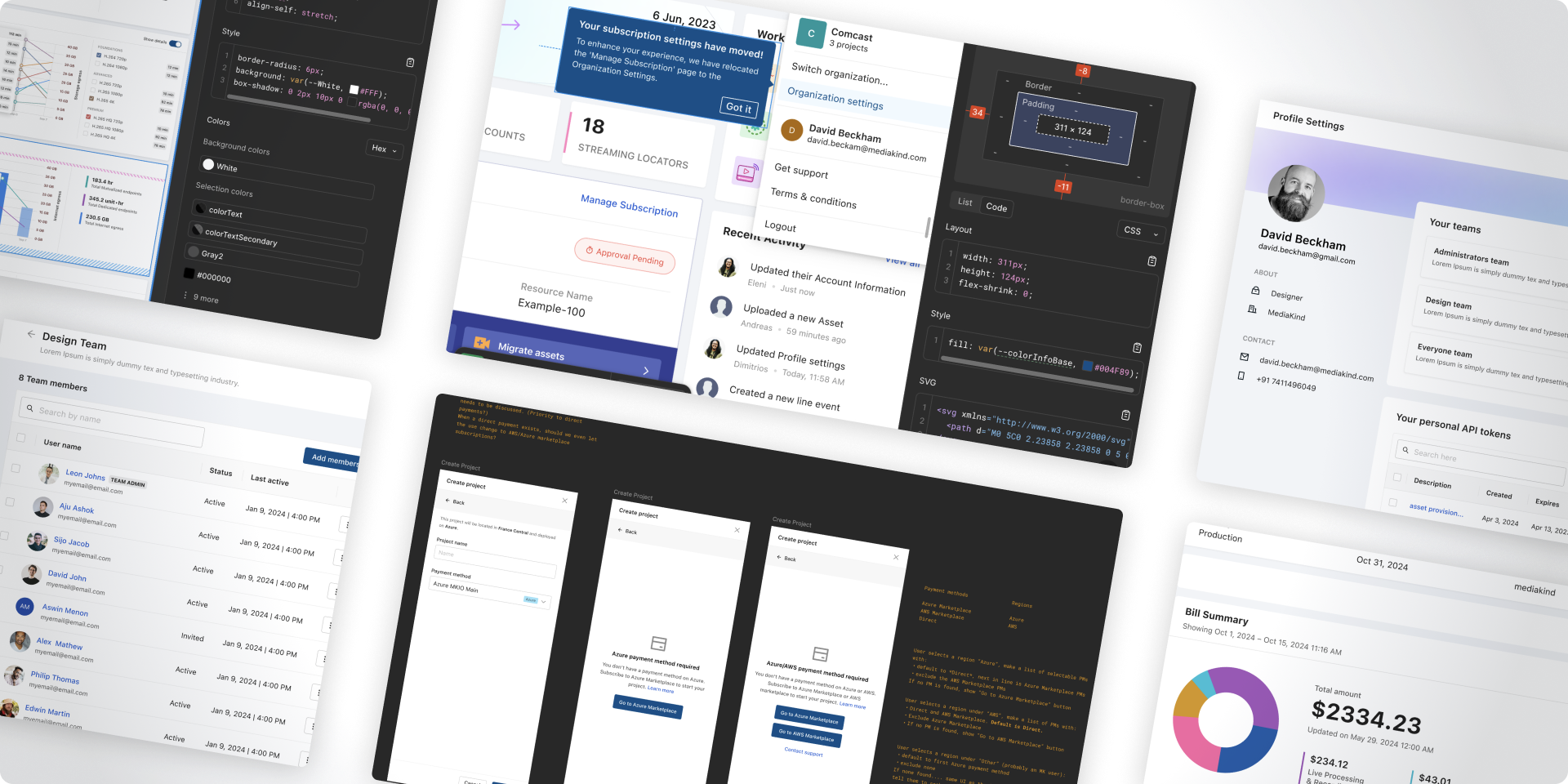
Visual Language & Design System
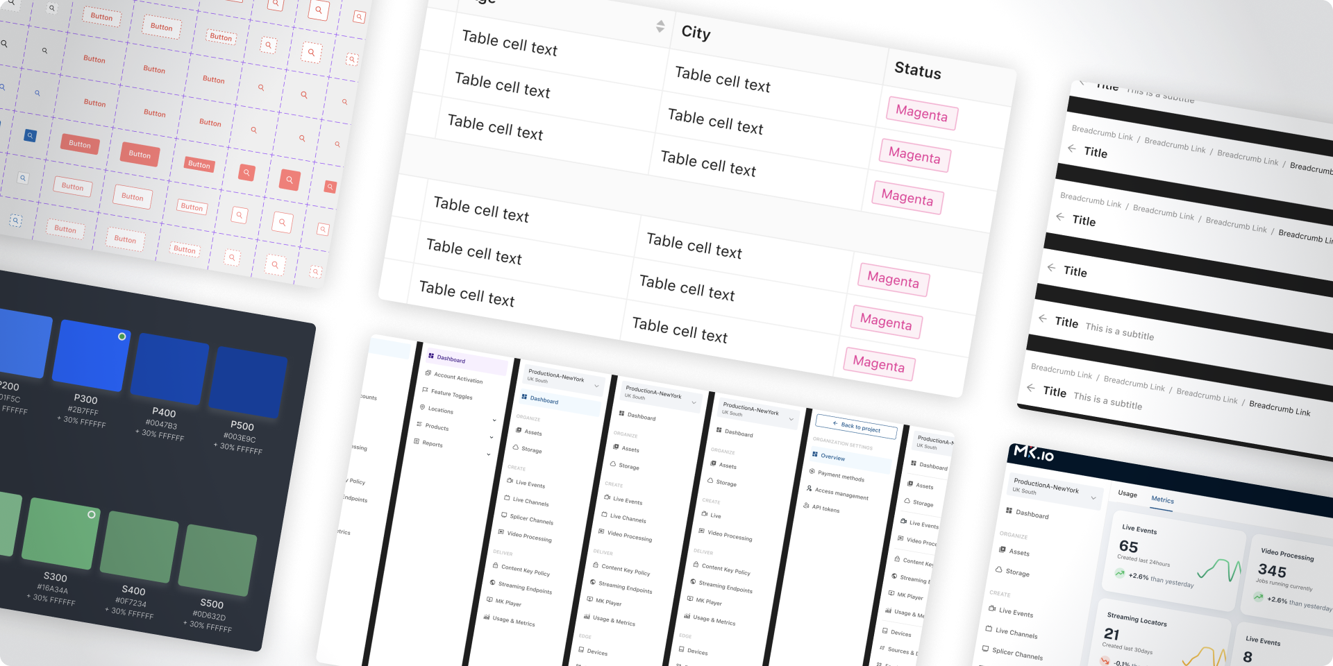
A unified design system ensures scalability and consistency across MK.IO’s multiple modules.
Purpose:
Establish a cohesive, modern, and brand-aligned visual language for all interfaces.
Components typically defined:
- Color palette:
- Primary (brand blue/purple)
- Secondary (grays, neutral tones)
- Alerts (success, warning, error)
- Typography:
- Sans-serif fonts optimized for dashboards (e.g., Inter, Roboto)
- Buttons & Inputs:
- Clear hierarchy — primary actions (Create Workflow), secondary actions (Cancel, Edit)
- Data Visualization:
- Graphs, progress bars, and cards optimized for monitoring latency, bandwidth, etc.
Output:
- Component library, Design Tokens, Figma Design System
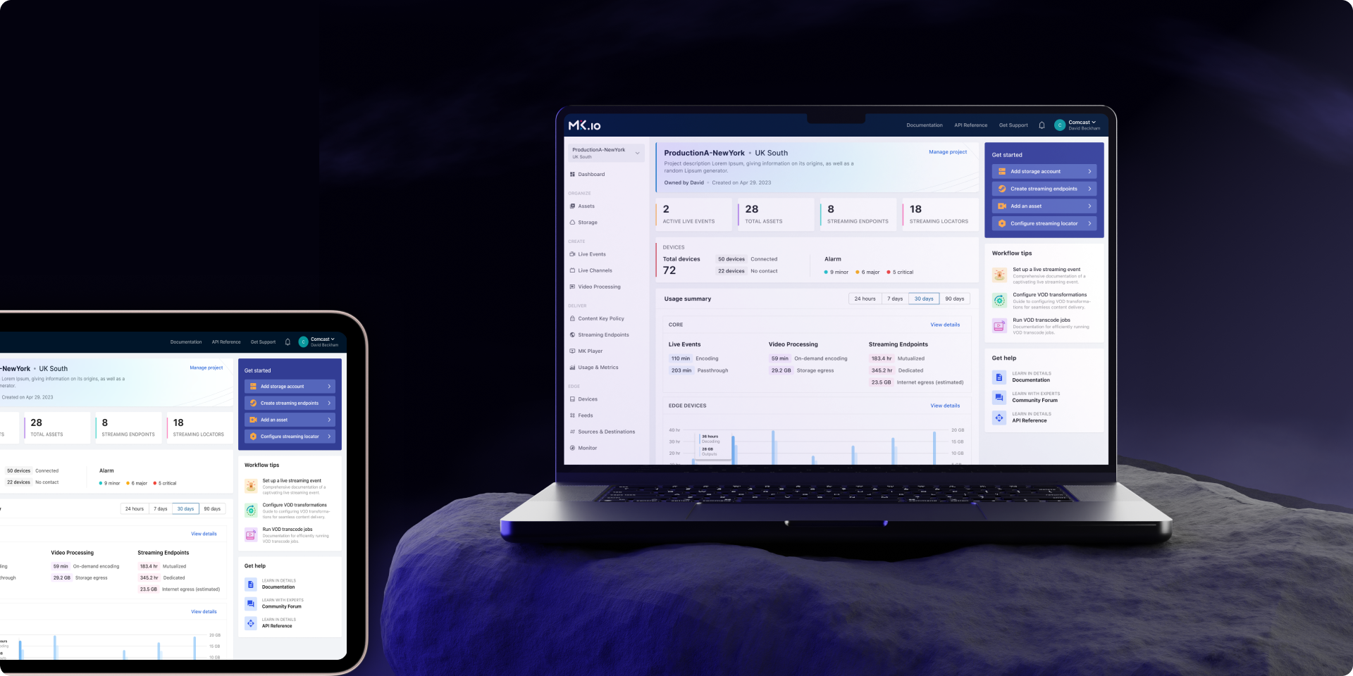
High-Fidelity UI Design
Now visual detail and interactivity come alive:
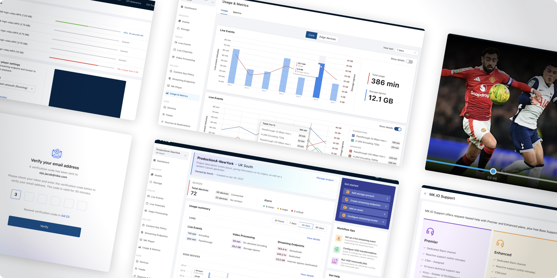
- Dashboard views with summary cards (active streams, bandwidth usage, billing alerts)
- Workflow builder interface with node connectors
- Light & dark mode options (common in developer tools)
- Responsive design for tablets/laptops
- Micro-interactions (hover effects, loading states) to make the interface feel responsive
Output:
- High-fidelity screens, clickable prototype, annotated mockups
Design Handoff & Collaboration
Designers collaborate with engineers to ensure accurate implementation.
Tools & Methods:
- Figma → Dev Mode specs (spacing, tokens, color codes)
- Storybook or coded component library alignment
- Weekly design-implementation reviews
- QA validation with pixel-perfect comparisons
Output:
- Design handoff package, component documentation, QA checklist